Poli-Plex-Icon: A tool for city image visualization in the age of complexity
– Efrossyni Tsakiri
Poli-Plex-Icon is a visualization tool that combines ideas of urban science and visual arts. It was initially developed in a Ph.D. research (2013–2018) that explored the perception of the city (city image) in history via its visualizations. Poli-Plex-Icon’s current applications include cultural projects, visual art exhibitions and urban visualization workshops.
Poli-Plex-Icon visualizes the city image with respect to complexity science and therefore it describes the city as a system of organized complexity. Accordingly, the complex city image presents properties, such as visual ambiguity and bottom-up formation processes. Poli-Plex-Icon combines interdisciplinary theories, techniques, and practices, such as urban mapping, textual analysis, visual semiotics, and layer superimposition. The incorporation of elements from planning, mapping and painting, make the visualizations both informative and communicative. They thus adopt a double, scientific and artistic role. They serve both as facts and artworks.
In the paper, we will briefly discuss the concept of city image and its visualization in plans, maps, and paintings, unveiling the path to the current connection of the city with complexity. Then we will present the Poli-Plex-Icon tool. Firstly, we will describe the tool model, which was developed based on Calvino’s novel Le Città Invisibili [Invisible Cities]. Secondly, we will briefly discuss Poli-Plex-Icon applications, and will postulate some thoughts and reflections for its further development.
City image definition, contemporary urban mapping and urban complexity
City image is a mental imprint of the city, a qualitative conception that includes sensations, impressions and perceptions about the urban environment. While city images are formed by individuals, collective city images represent public opinions and form a city’s identity. Following the so-called subjective or spatial turn of the ‘50s, the way people perceive a city becomes a popular subject that appears worldwide in urban theory, urban geography and environmental psychology. Heidegger (1951) talks about the animate entity that shapes space and ‘unifies the material and the intangible’, Debord (1955) discusses the atmosphere experienced in a flâneur’s urban derive, Bachelard (1958) introduces topophilia, the love of strange places, Yi-Fu Tuan talks about sense of place, the connection of man and space, Norberg Schulz (1979) reinvents Genius Loci, the roman protector god of place, and Rose (1995) discusses the reflection of sense of place to people or groups. There are also means to evaluate the ability of a place to appeal and create strong mental images. Lynch (1960) describes it as imageability, legibility or iconicity. Adopting insights from the above definitions, the term city image signifies perceptions that form a city’s cultural imprint and identity.
Since the ‘50s various techniques have been developed in urban theory that aimed to map (record, visualize and locate in space) the multifarious elements that people include in their city images. Psychogeography (Debord 1955), mental mapping (Lynch 1960), serial vision (Cullen 1961), cultural townscape (Ventury et all. 1972), acoustic ecology (Southworth 1969) are only a few of the many key mapping techniques of that era. At the turn of the 21st century, urban mapping incorporated all these. But two important realizations have been added to the above developments and influenced contemporary urban mapping: a) the evolution of digital technology that brought about the emergence of the Information Age, characterized by smart technologies, the internet and more importantly big data and b) complexity. A complex system consists of multiple parts that interact in random ways, presenting self-organization and giving rise to novelty in the global scale (Heylighen 2008). Complexity was introduced in urban science. As a consequence the city today is defined by many scholars as a system of organized complexity (Batty & Longley 1994). Accordingly, urban complexity has been defined as the simultaneous action, interaction and combination of various factors, such as demographics, transportation, ecology, culture, economy, movements, networks, urban morphology, etc. Urban perception is also complex, as humans react to urban complexity by forming multifarious and complex mental images.
Contemporary urban mapping experiences a tremendous development due to digitalization and complexity, as now it is possible to map complex, invisible elements and visualize multifarious data. But more importantly, it tends to exclude authoritarian perceptions and deemphasizes central and top-down procedures. It accentuates the importance of informal, bottom-up, participatory processes that produce instability, dynamism, and fluidity, unfolds the hidden spatial characteristics and deals with complexities inherent in the urban environment. The contemporary mapping techniques are interdisciplinary, fluid, partly subjective, partly objective, combine science with art and confront mapping as a process rather than as a product. According to critical realism, their aim is to unfold the ontological character of social reality, the reality of senses and experiences. Contemporary urban mapping confronts city images as complex social constructs. It combines the quantitative and the qualitative, explanation and interpretation, elements of history, culture, social structure, human action and interaction, addressing a new, complex reality that describe cities as multilayer constructions with multifarious meanings (Archer et al. 2016, Muscogiuri 2015).
Why combine plans, maps and paintings
Significant visual evidence about the dominant perceptions that form city images in several historical periods can be found in plans, maps, and paintings. The stiff, literal and conventional rules of planning and cartography contradict the soft and polysemic character of painting, forming a broad and cohesive spectrum, where all perceptions, ideas, thoughts, fears, and impressions of people for the city are filtrated. Interestingly, although each of these disciplines has its own conventions, symbols, rules, techniques, and expressive means, there have been always interrelations. Maps that look like illustrative paintings, plans that depict people and customs, paintings that include abstract map elements, etc. are very common throughout the history of urban visualization. All three disciplines filter all kinds of perceptions and ideologies: the extensive use of landmarks serves as the means to easily recognize a city. Geometry, perspective, color palette, decoration, are used to emphasize dominant religious or political narratives. Moreover, in every historical period, plans, maps and paintings incorporate the developments in science and technology. In the Renaissance they begin to depict space more accurate, while from the 19th century onwards paintings become intuitive, revealing elements about the way people feel about the city (Tsakiri 2017).
From the mid-20th century and onwards many scholars discuss the incorporation of historical visualizations (such as plans, maps, and paintings) in the investigation of the city image. Creative geography is “making space for geographers to recognize the expanded role of artistic and creative practices–based research within geographical scholarship” (Hawkins 2013). Later on, a new discipline, urban visual culture, is formed, that studies all visual means that construct city images in the spectrum of science and art (Jenks 1995, Mirzoeff 1998, Burke 2001, Jupp 2006). Thus, a new, contemporary bridge has been inaugurated between science and art: urban analysis and traditional mapping techniques (mostly analytic) embrace artistic practices. Psychogeography, mental mapping, and map art are paradigms of contemporary city visualization approaches that combine scientific and artistic elements, include urban analysis techniques, traditional map making, features of architectural drawings and tools such as layer superimposition, collage, action painting, etc. The above justify the combined use of elements from planning, mapping and painting to visualize the image of the city.
Poli-Plex-Icon definition and origin
Poli-Plex-Icon is an acronym for the words ‘Polis’ (meaning city), ‘Plex’ (meaning complex) and ‘Icon’ (meaning image). The latter also designates the iconic: something special, unique, with a distinctive character. Polis-Icon is a rephrasing of the iconic city, meaning a city with a ‘strong image’ (Kevin Lynch named it ‘imageability’) and Poli-Plex-Icon describes that city image, which is based on complexity and therefore reflects the contemporary complex urban reality, which consists of multiple layers and interacting processes.
The development of Poli-Plex-Icon tool lasted several years (2008–2018 as a PhD research and from 2018 as a Postdoctoral ongoing research that aims to explore several applications of the tool). During this period various visualization experiments were conducted, initially based on Calvino’s Invisible Cities and afterwards with real cities.
The Poli-Plex-Icon tool in 4 steps
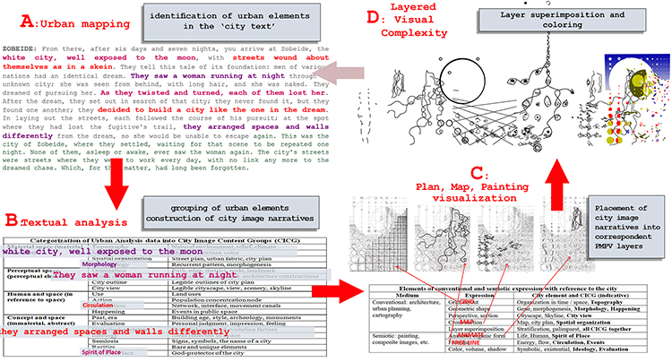
The Poli-Plex-Icon tool aims to visualize the complex city image by combining urban science with visual arts. It uses two strategies, organization and mingling, in a constant loop of succession. It consists of 4 fundamental steps: a) urban mapping, b) textual analysis, c) plan-map-painting visualization, and d) layered visual complexity.
Α) Urban mapping is used in order to collect and record as objectively as possible, urban elements and people’s perceptions that form city images. The tool adopts mapping techniques that collect multifarious data, historical, anthropological, morphological (in many scales, such as the city plan, the buildings, street furniture, etc.), social, land uses, transportation networks, etc. and mapping practices that explore subjective elements and perceptions (such as Lynch’s 5 element, psychogeographic, multisensory mapping, etc.), as an attempt to record as much as possible of the complexity of the contemporary city. In this step users arrange elements (visible and invisible, material and intangible, obvious and latent) in groups. Note that the type of groups and subgroups in the table may vary depending on the specifics of each study.
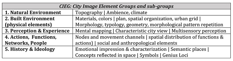
Table 1: City Image Element Groups and sub-groups (CIEGs)
B) Textual analysis is used in linguistics to elaborate texts (both verbal and visual) and retrieve their multiple meanings. Scholars explain that every text is the subject of multiple interpretations (semiosis). Barthes (1977) organizes the meanings in connotation layers, while MAK Halliday (1978) describes the signs of a text as semiotic pores, carriers of ever-increasing, expanded, open and abstract meanings that function like non stable points of intensity in spectrums of concepts. By analogy, the city has been characterized as ‘text’ (Duncan 1990) and there are terms and phrases, such as Hillier’s ‘Space Syntax’ or ‘the City as Text’ (e.g. Donald 1992, De Certeau 2002), that refer to structured explorations of the urban environment. In the Poli-Plex-Icon tool the city image elements that users collects in step A of urban mapping, are treated like words in a text and placed in an organizational shape (CIEGs). In the second step conceptual deepening begins: starting from the literal, denotative, obvious and direct city image content, the tool proposes the construction of associations that can unveil latent, indirect meanings and accentuate social, ideological, and cultural connotations. But textual analysis has also another function, the creation of new ‘sentences’ by the restructuring of elements. The users of Poli-Plex-Icon can organize urban elements into sequences of congenial meanings, in other words, they can construct city image narratives (CINs). In addition, during the visualization process, they can deploy respective visual semiotic techniques to enrich the city image narratives with connotative visual shapes. At a later stage of the visualization process, they will superimpose these connotation layers.
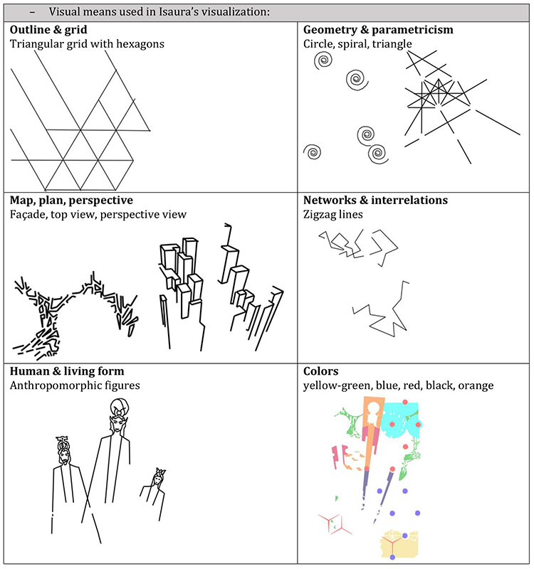
C) Plans, maps and paintings form the background (both conceptual and visual) that creates the dual, scientific and artistic, character of the visualizations. As explained above in the paper, throughout urban history these three means have been the carriers of perceptions about the city. The specific expressive means that correspond to plan-map-painting triptych are shown below [Table 2].
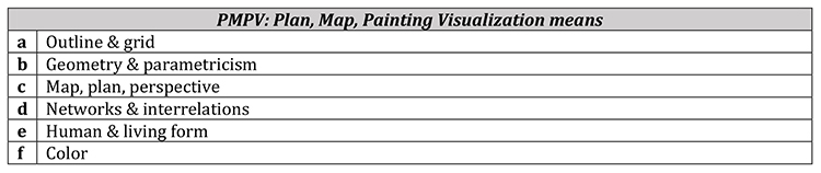
Table 2: Plan, Map, Painting Visualization means (based on the Ph.D. thesis of the author of the paper)
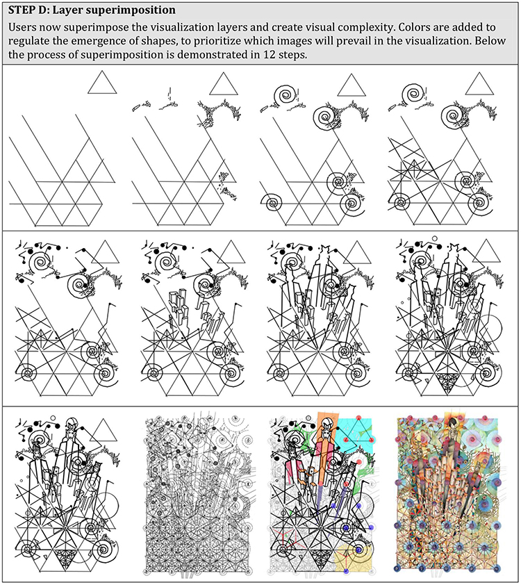
D) Layered visual complexity reproduces the contemporary understanding of the city as a system of organized complexity through the arrangement of city image narratives in superimposed layers, a structure analogous to a palimpsest (papyrus, parchment, or generally handwritten material where the original text was scraped off for another to be written on top of it). Palimpsest determines the layered structure of a phenomenon. Architects and urban planners attribute this property to cities, as successive cultures have accumulated and left their traces, shaping the contemporary city image (e.g. Bedard 1994, Huyssen 2003). Chaos and order co-exist in an ‘urban palimpsest’, in a matter of fact, they describe two different modes of investigation or of perception: Chaos is created as multiple cultural elements from different historic periods are mingled in time. However, an archaeological ‘excavation’ of the urban site (‘palimpsest’) can separate and determine the different layers. In terms of perception, as De Certeau puts it, one can be lost in the urban labyrinth, as he moves around on the ground, overwhelmed by urban complexity, while at the same time he/she can perceive and understand the greater urban picture while standing on the top floor of a tall building (De Certeau 2002).
The multi-layer structure of Poli-Plex-Icon enables the elaboration of myriads of urban elements as an urban palimpsest. But here not only time and history, but also narratives (CINs, as explained in step 2), play a structuring role. By analogy to the palimpsest, while the layering organizes, producing order, the superimposition disorganizes and mingles, producing chaos. And this can be a repetitive process. The clarity and specificity of the visualizations can be subsequently regulated by users with the addition of color. The layer superimposition process helps the creation of open, dynamic and flexible shapes, appropriate for the expression of polysemic and complex concepts, like the city. Thus, the tool manages to sketch rough and ambiguous versions of the city image, rather than imposing specific and established ones. Viewers are invited to participate mentally in the process of infinitive readings. They can use the visualizations as vehicles for the construction of personal city images, in a playful way that resembles discovering hidden messages in magic pictures.
Poli-Plex-Icon initial development based on Calvino’s novel Invisible Cities
Calvino’s novel Invisible Cities (1972) has been the inspiration and the initial field of experimentation for the development of Poli-Plex-Icon tool. The life and work of the litterateur reveal a pioneering personality with an interest in mathematics, relativity theory, and quantum mechanics. Calvino moreover adopted the positions of linguistics that discussed in the 60s and 70s the polysemy of communication. All of the above have influenced him in the writing and structure of his novel. Indeed, the study of Invisible Cities certifies that it functions as a literary model of the complex and layered city: As the novelist himself testifies, all 55 cities describe Venice. They are organized in the pages of the book as the layers of a palimpsest.
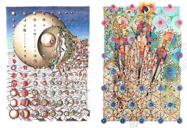
By analogy with Calvino’s layered city, the starting point of the urban visualization in Poli-Plex-Icon are various descriptions of the city (scientific and pre-scientific, literary, historical, personal, urban, encyclopedic, etc). All of them form the city text. Users apply to this city text textual analysis, extract urban elements, organize them into city image element groups, build city image narratives and place them on superimposed layers, producing eventually the layered city image. Below we can see a 4 steps diagram with the application of the tool in the visualization of Calvino’s Invisible City Zobeide [Image 1] and the visualizations of Zobeide and Isaura [Image 2].
1. The visualization of Zobeide Invisible City in 4 steps. Source: E. Tsakiri, 2014.
2. Visualizations of Zobeide and Isaura Invisible Cities. Source: E. Tsakiri, 2010.
The visualization of Invisible City Isaura in 4 steps
Isaura is one of the four invisible cities that have been visualized in the experimentation process for the development of the Poli-Plex-Icon tool. Below the 4-step process is described.

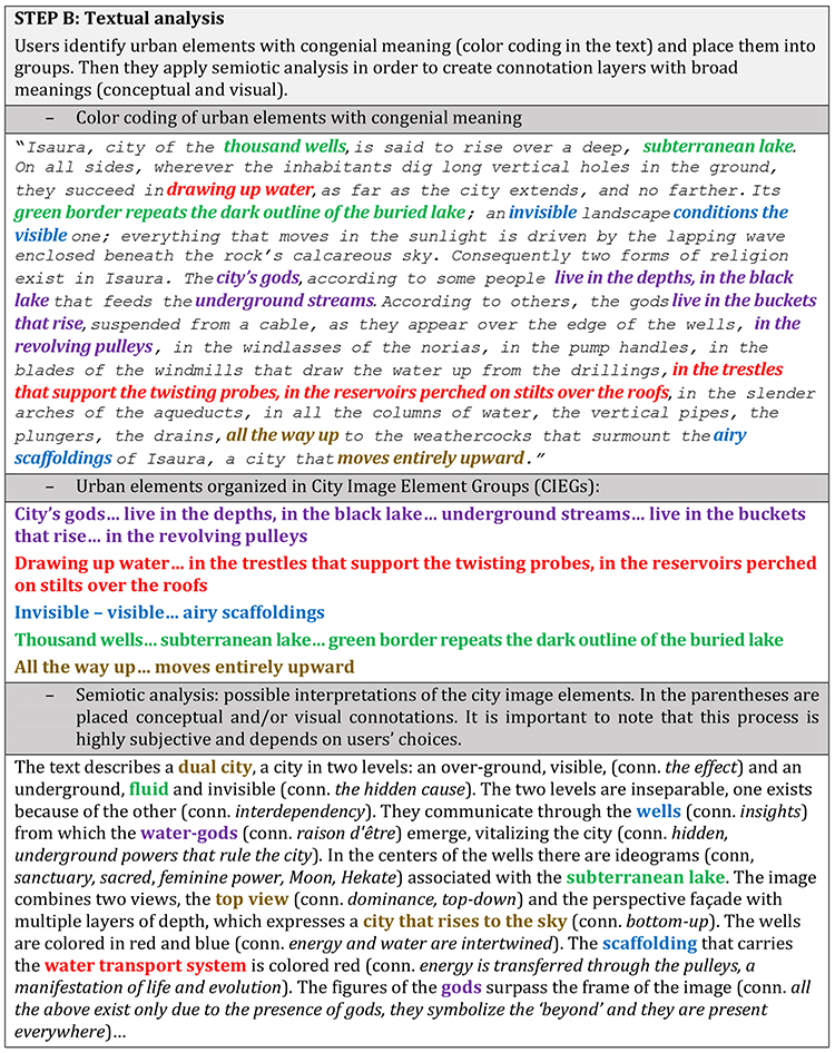
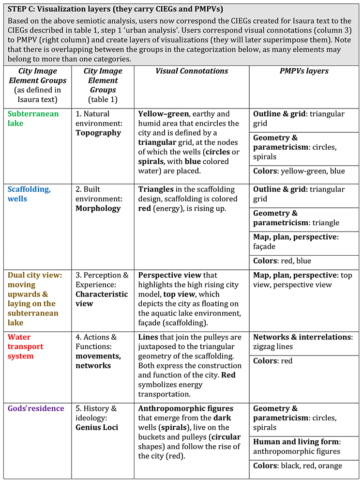
Tables 3A-D. Poli-Plex-Icon 4 steps model (Isaura visualization)
The images below analyze the visualization process for three invisible cities (Isaura, Zobeide, Eutropia) and provide a comparison. The depictions are gradually constructed from the superimposed layers that represent visually the various urban elements that have been chosen by users. The first diagram (above) depicts the visualization process analyzed in five city image element groups (a. history & ideology, b. actions & functions, c. built environment, d. natural environment, e. perception & experience) each placed on a separate layer. The final visualization is produced by the superimposition of the layers and the coloring. In the second diagram (below) we can see the visualization process analyzed in five plan-map-painting visualization layers (a. grid & layout, b. geometry & parametricism, c. perspective, d. human & living form, e. networks & interrelations) with the corresponding city image element groups placed on them. Note that some of the layers in the first diagram can be similar to the layers in the second diagram. This happens because both diagrams express two different classifications of the same urban elements: the former with relevance to city image urban mapping and the latter with relevance to city image expression in the plan-map-painting visualization triptych. There are infinite possibilities for the grouping of elements and all users can choose their own combination of layers (as noted before, the Poli-Plex-Icon tool combines objective with subjective methods). The grouping of elements is a textual analysis tool that organizes the abundance of urban data. It is common in textual analysis to have identical entries in different groups.
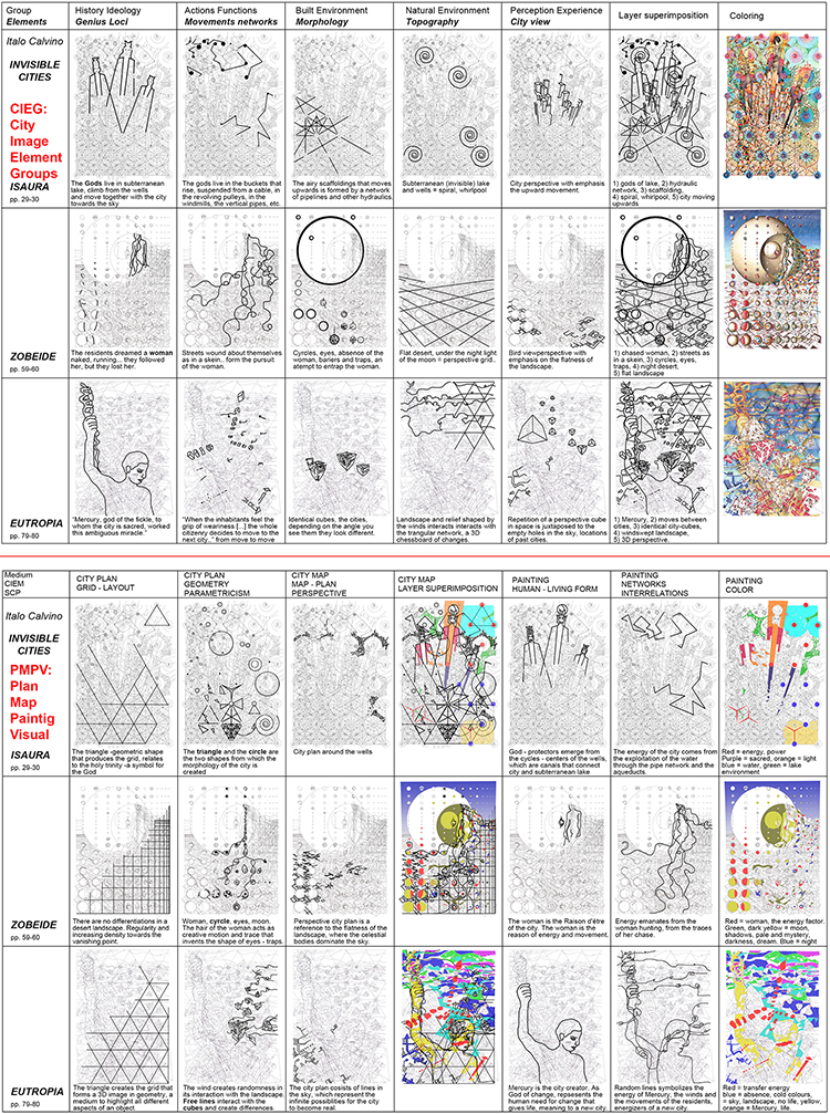
3. The visualization of Isaura, Eutropia and Zobeide, steps 3 & 4. Source: E. Tsakiri, 2014.
Poli-Plex-Icon final model in seven steps
After the experimentations with the Invisible Cities text, the Poli-Plex-Icon tool was tested in the visualization of existing urban places (see next section). The process of the four steps has been further developed and finally expressed on a more analytical (and complex) model of seven steps and two stages, urban analysis –or deconstruction (steps 1 to 4), and visualization –or reconstruction, (steps 5 – 7). Below we describe the 7 steps model of Poli-Plex-Icon.
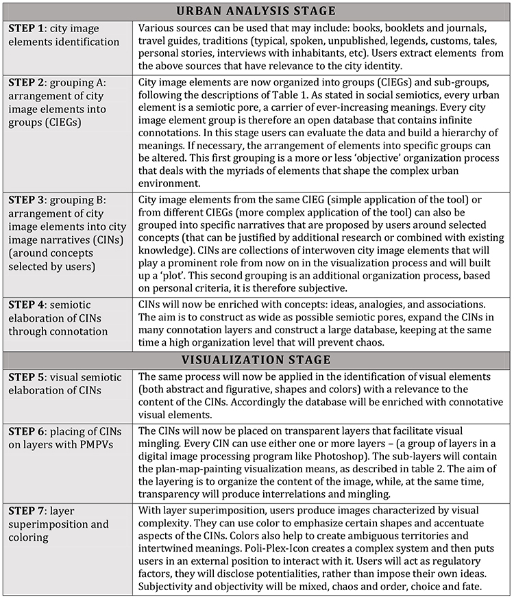
Table 4. Poli-Plex-Icon 7 steps model
In the following image urban elements are illustrated as semiotic pores. The left column corresponds to step 1 and the elements appear in random positions in the organization scheme. In the next column (Step 2) they appear organized into the City Image Element Groups. In the next column (Steps 3, 4, 5) elements of the same or different groups are organized into City Image Narratives. On the left side of the ellipses, users add relevant concepts forming connotation layers, while on the right side they add visual connotations. All shapes in the diagram are depicted as cycles and curves, representing that they are dynamic territories open to changes and different interpretations. In Steps 6, 7 (right column) the layers that carry the PMPVs are being superimposed. As explained, they emanate from the historical and evolutionary study of the city image in planning, mapping and painting. Respectively, the visualization will resemble a plan, a map and a painting at the same time, and this may give it a unique and original character.
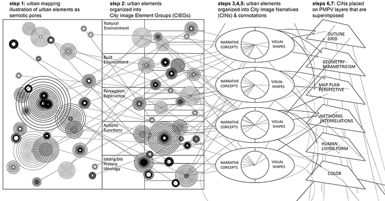
4. Poli-Plex-Icon model in seven steps. Source: E. Tsakiri, 2018.
Poli-Plex-Icon applications into existing urban places
Poli-Plex-Icon has been tested on the visual transformation of Kithira (an island in the south of Greece). The process began with the mapping of urban elements from various sources. Some examples were: a. ‘religious festivals’, b. ‘mixed, European and Mediterranean architecture’, c. ‘rare siempre vive flower’ that grows only on the islet of Xytra next to Kithira, d. ‘romance of Paris and Helen’, etc. The elements have been organized into the CIEGs. For example: a. ‘religious festivals’ in CIEG ‘4’ (actions & functions) and CIEG ‘5’ (history & ideology), b. ‘mixed, European and Mediterranean architecture’ in CIEG ‘2’ (built environment) and CIEG ‘3’ (perception & experience), c. ‘rare siempre vive flower’ in CIEG ‘1’ (natural environment), d. ‘romance of Paris and Helen’ in CIEG ‘5’ (history & ideology). The coloring of the elements now represents the selection and construction of CINs by users. Each CIN has a title to signify its content. For example, all light blue elements are grouped into the CIN named ‘Life & Food’, while all red elements are grouped into the CIN named ‘Love, Joy, Venus’, etc. In this step users search for concepts associated with every CIN, for example, ‘Love, Joy, Venus’ is enriched with words, such as ‘beautiful’, ‘romantic’, ‘secret’, ‘protection’, ‘heart’, while the visual connotation include shapes such as curved, red, body, woman, darkness, hidden, etc. Next to the CIN ellipses in the diagram, we can see the cycles that represent the CIEGs (for example, ‘natural environment’, ‘built environment’, etc). Both groupings will be now used in the mingling process. We have used a system of PMPV layers. Users visualize selected elements on these layers as seen in the right side of the diagram, and gradually a complex image appears. For example, above right we can see PMPV ‘geometry & parametricism’, with which we codified the siempre vive flower, the cave and the castle. But we propose the depiction of the flower into a triangular grid, so we have also used the PMPV ‘outline and grid’ for the same purpose . Accordingly, we can use all CINs and CIEGs.
Visual complexity is gradually being built through a rotation of processes that organize and mingle, classify and interrelate. Interaction and organization are combined, and chaos is arranged in a dynamic and fluid manner. On the right we can see Kithira Island visual image in the process. The function of color in the final step is very substantial, as it adopts the role of implementing all the potentialities that the tool constructs in the previous steps. We would say, that color represents ‘Life’, the power that chooses which figures will be brought to light. But again, as color represents a mathematical continuity (in its infinite shades), it creates light and darkness, birth in many degrees with an ambiguous nature.

5. Kithira Poli-Plex-Icon diagram. Source: E. Tsakiri, 2018.
The visualization of the old town of Chania in Crete was undertaken in 2017 by a team of 5 students that experimented with the Poli-Plex-Icon tool. The students created layers of Chania mappings carrying urban elements (e.g. psychogeographic maps for feelings, experiences, Lynch’s 5 elements maps, maps of morphological patterns, etc.). Then they superimposed the layers in various combinations and created visualizations that pointed out interrelations between the mappings [Image 7.]. The team worked in an urban mapping workshop that used different mapping approaches and produced 61 different maps of Chania that were subsequently used as layers to create a multilayered ‘psychogeographic guide of the old town’ [Image 6.].
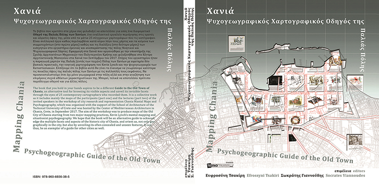
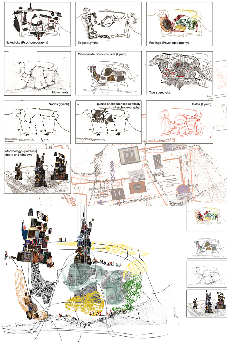
6. & 7. Mapping Chania. Psychogeographic Guide of the Old Town. Athens: Technogramma Med. cover page | Chania multi-layer mapping, layer by layer analysis and a paradigm of superimposed layers 3, 5, 4 & 10 (E. Apostolaki, M. Xekardaki, K. Pagkalou, A. Papastergiou, G. Hatzidakis. Coordination: E. Tsakiri). Source: Tsakiri, E. and Yiannoudes, S., 2019.
The visualization of Victoria Square in Athens was conducted in 2018 by a group of ‘new artists’ (under- and postgraduate architecture and art students) that participated in ‘Elpidos Mapping. Getting to know Victoria Square’ urban mapping workshop (organized by E. Tsakiri & VSP Project). The participants were asked to write short, personal tales (of the type of Calvino’s Invisible Cities) for Victoria Square. Afterwards, they visualized the tales in transparent paper and superimposed them. Image 8. presents the visualizations and a selection of layer superimposition variations. The experiment has shown that some of the visualizations were so intense, that they influenced the outcome and gave it a distinctive identity, regardless of the choice or the number of layers used to construct it. The black horizontal line, for example, (a visualization of the local groups expressing politically extreme and fascist positions) prevails in all superimpositions.
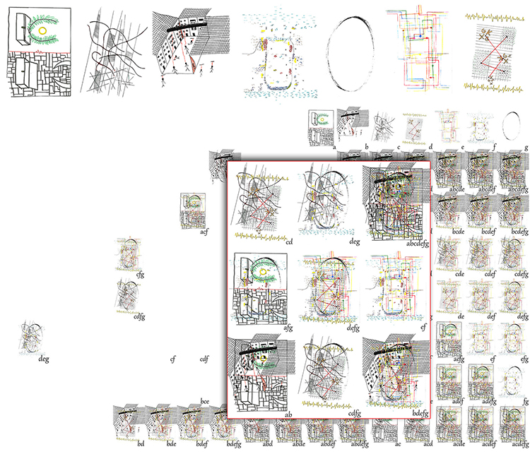
8. Victoria Square visualization. Source: E. Venetzanos, N. Pana, M. Stamatogianni, M. Vletzi, P. Mpourtzinakou, S. Bolonaki. Coordination: E. Tsakiri., 2018.
Poli-Plex-Icon tool has applications that go beyond 2D visualization. The concept of layer superimposition can be applied in a 3D space: The layers can be transparent structures that carry identity elements. They can be located in a room and create space for viewers to pass through and participate in the visualization process, instead of supervising it. This was the idea of the Utopian Polis Reading by Design [Image 09]. Projections on semi-transparent constructions, mirrors and interconnected artworks can create similar multi-layered environments, as in the artwork Sails and Seas of the Apoplus visual art exhibition [Image 10]. Finally, Poli-Plex-Icon tool is currently used in a funded research project that aims to accentuate the identity of places that played an important role in the Greek revolution of 1821. The tool is bringing together 20 architects, urban planners and artists (with various styles and means), and many architecture and art students that will produce in 2021 experimental artworks for the 200th anniversary of the Greek revolution.
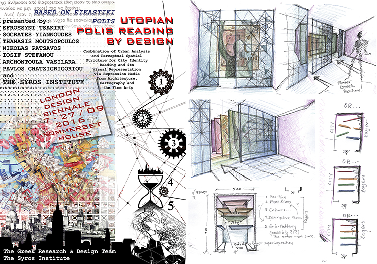
9. Utopian Polis Reading by Design. Source: E. Tsakiri, 2015.
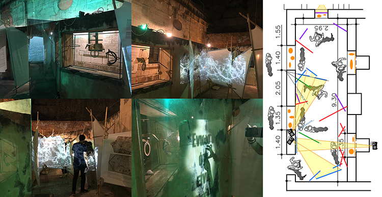
10. Sails and Seas. Source: E. Tsakiri. Trip to Magna Grecia (UNIWARCH team), Navigational Metamorphoses (TUC students) in Apoplus Exhibition.
Poli-Plex-Icon application in urban policies, planning and design
Although Poli-Plex-Icon has been developed as a tool for the ‘’artistic’’ visualization of mapping data –and in this sense it is primarily applied in the artistic field, it can also be useful as a tool both in the formulation of urban policies and in the process of urban design: It can provide urban planners with a multi-functional analysis tool that will feed the research, by exploring in detail a multitude of urban elements, while the visualizations can inspire the morphology in urban or landscape design plans.
As described, the steps of the urban analysis stage result in the creation of an organized (CIEGs) database. Multifarious cartographic data can be recorded and presented both in keywords and in detailed lists that may contain properties, extensive text or other forms of representation via references in endnotes or in hypertext. The tables of data (such as the one presented in the visualization of Kithyra Island), need to ensure maximum supervision and therefore it is important to include synoptic forms with codified data—the same concept that applies for the design of maps. Keywords can simultaneously belong to many different groups and can have separate references for each of them. Thus, each keyword, (each mapping element), provides information both for the group to which it belongs (thus helping the research for that group) and as an open list of properties that belongs to different groups (this way planners can observe the element’s multifarious effects). In other words, the analysis tool can feed urban research in two dimensions, both vertically (exploring in depth the impact that an element may have on many groups that it is included) and horizontally (exploring the impact of every group, which depends on the number and type of data it includes).
For example, let’s hypothesize that planners observe that the element ‘rare siempre vive flower’ in the paradigm of Kithyra Island belongs to many CIEGs. This means that the element’s impact is manifested in many different aspects of Kithyra’s image, so it turns out that it is worth structuring a place branding strategy and include the flower. And vice versa, suppose that planners need to determine the quickest, most effective and appropriate field to diffuse an urban policy. In this case they will select the CIEG that contains the most data. The above may seem somewhat self-evident when the object of study is limited in scope and complexity. However, when the object is large and the elements being explored are many, the organization in two dimensions (horizontal and vertical) and the simultaneous representation both in tables with keywords and in detailed lists of properties, can prove to be extremely useful tools.
In addition, the ‘artistic’ visualizations themselves can be an inspiration for urban design, as they can feed the proposed morphology with visual elements that emerge from the analysis of the site. The visualizations can be the backbone for the master plan and the visual data can be used as a vocabulary of forms. In this way the plan will repeat the surrounding forms and transplant the visual complexity of its environment (it will be a self-similar reproduction of that morphology). This is the case in the following urban design proposition, in which the suburban park of the city of Huelva is built on the basis of mappings that have been conducted with a methodology similar to Poli-Plex-Icon [Image 11.].
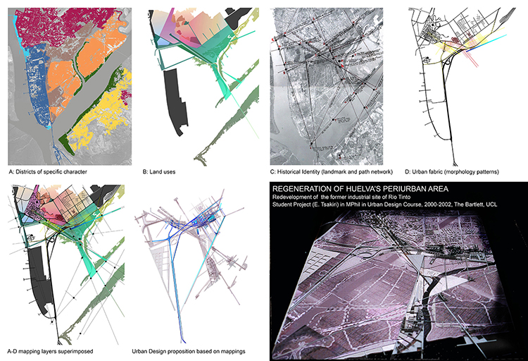
11. Huelva Park. Source: E. Tsakiri, 2000.
Reflection and conclusion
The important advantage of Poli-Plex-Icon tool in urban visualization lays in its substantial organizational capacity, based on the grouping (CIEGs, CINs, and PMPVs) that create a rich multifarious and, more importantly, ‘open’ (non-finite and capable of further development) database, with urban elements, both conceptual and visual. In addition, the database records the relationships and interactions between urban elements. Information is thus perfectly organized, can be retrieved, double-checked and revised. Alternative groupings and element combinations are also supported. All the above make Poli-Plex-Icon a useful tool capable of producing multiple images from different users with a combination of objective and subjective characteristics.
The visualization possibilities are infinite. Poli-Plex-Icon uses its organizational capacity in order to simulate complexity. The superimposition of transparent layers mingles the elements and creates the conditions of ‘controlled chaos’. The multiplicity, variety, and diversity of the shapes, due to their simultaneous presence on the superimposed layers, gradually leads to visual self-organization and creates complex patterns, a process that produces visual complexity. The visualization functions like a complex system, where interactions of elements in the local scale create synergies and eventually affect the global scale, by provoking emergence.
This is happening in the final step of the visualization process that involves coloring. Although users decide for the colors, they do not produce work in a top-down manner, but, in some way, they are directed by the image itself (as mentioned before in Step 5, the visualization uses a databank that contains also suggestions about the coloring). In this step, users evaluate dynamics appearing in shapes and patterns, and selectively highlight certain territories with color, or deemphasize others. This creates situations where many different shapes compete for which one will prevail, a process that is defined as perceptual ambiguity and was proposed by Gestalt psychologists. The notion of perception recently entered complexity science. Zyphur & Beal (2006) and Peter & Swilling (2014) discuss perceptual emergence, a term that describes the outcome of the multiple ways of observing the behavior of a complex system. Perceptual emergence is relative and not absolute, and depends on the different viewpoints of the observers.
Summarizing, Poli-Plex-Icon functions as a continuously renewable ‘notebook’ of concepts and shapes that potentially produce infinite variations that combine objective and subjective elements. It maps, in this sense, multiple perceptions of the city. The combination of organizational and mingling tools creates complexity. Users adopt a new role: From designers and founders of forms, they turn into tracers. They detect forms that emerge from the ‘context’. Therefore, Poli-Plex-Icon can contribute in urban visualization, specifically in critical cartography (that embraces scientific and artistic practices), and illustrate there, the multifarious dynamics of the complex city.
References
— Archer, M., Decoteau, C., Gorski, P., Little, D., Porpora, D., Rutzou, T., . . . Vandenberghe, F. (2016). What is Critical Realism. [online] Perspectives. A Newsletter of the Theory Section. Available at: http://www.asatheory.org/current-newsletter-online/what-is-critical-realism[Accessed 12.06.2020].
— Arnheim, R. (1974). Art and Visual Perception: A Psychology of the Creative Eye. California: University of California Press.
— Bachelard, G. (1958). La Poétique de l’Espace. France: Presses Universitaires de France.
— Barthes, R. & Heath, S. (1977). Image Music Text. London: Fontana Press.
— Batty, M., & Longley, P. (1994). Fractal Cities. A Geometry of Form and Function. London: Academic Press Limited.
— Bedard, J. F. [ed.] (1994). Cities of Artificial Excavation: The Work of Peter Eisenman 1978-1988. New York: Rizzoli International.
— Burke, P. (2001). Eyewitnessing: The Uses of Images as Historical Evidence. London: Reaktion Books.
— Calvino, I. (1972). Le Citta Invisibili [Invisible Cities]. Guilio Einaudi Editore.
— Certeau, M. (2002). Chapter 11: The Practice of Everyday Life. In: G. Bridge & S. Watson, eds. The Blackwell City Reader. 2nd ed. Malden, MA: Blackwell Pub.
— Chandler, D. (1992). Semiotics for Beginners. [eBook]Aberystwyth University. Available at: http://users.aber.ac.uk/dgc/Documents/S4B/sem01.html [Accessed 12.06.2020].
— Debord, G. (1955). Introduction to a critique of urban geography. [online archive] Situationist International (online). Retrieved from the collaboratory for digital discourse and culture, Virginia Tech. www.cddc.vt.edu/sionline/presitu/geography.html [accessed 12.06.2020].
— Donald, J. (1992). Metropolis: The City as Text. In R. Bocock, & K. Thompson (Eds.), Social and Cultural Forms of Modernity. Cambridge, UK: Polity Press.
— Dunkan, J. S. (1990). The City as Text: The Politics of Landscape Interpretation in the Kandyan Kingdom. Cambridge University Press.
— Gregg, R. E. (2009). Panorama, power, and history: Vasari and Stradano’s city views in the Palazzo Vecchio [PhD Thesis]. Baltimore USA: The Johns Hopkins University.
— Halliday, M. (1978). Language as social semiotic: the social interpretation of language and meaning. California: Edward Arnold.
— Hawkins, H. (2013). For Creative Geographies: Geography, Visual Arts and the Making of Worlds. Routledge.
— Heylighen, F. (2008). Complexity and self-organization. In: M. Bates, & M. Maack eds., Encyclopedia of Library and Information Sciences. Taylor & Francis.
— Huyssen, A. (2003). Present Pasts. Urban Palimpsests and the Politics of Memory. Stanford: Stanford University Press.
— Jenks, C. (Ed.). (1995). Visual Culture. London, New York: Routledge.
— Jupp, V. (2006). The Sage Dictionary of Social Research Methods. Sage.
— Kandinsky, W. (1926). Punkt und Linie zu Fläche. Germany: Bauhausbücher.
— Kress, G., & Van Leewen, T. (1990). Reading Images. Deakin University Press.
— Lynch, K. (1960). The Image of the City. Cambridge, MA: The M.I.T. Press.
— Mirzoeff, N. (1998). What is visual culture? In: N. Mirzoeff ed., The Visual Culture Reader. London, New York: Routledge.
— Muscogiuri, M. (2015). Mapping the invisible. Creative cartography as a tool for representing the changing contemporary city. In: A. Marotta, & G. Novello eds., Disegno & Citta. Drawing & City. 37th Convegno Internazionale del Docenti della Representazione, Rome. pp. 1134-1138.
— Norberg-Schulz, C. (1979). Genius Loci Towards a Phenomenology of Architecture. Milano: Rizzoli International Publications, Inc.
— Panofsky, E. (1939). Studies in Iconology. Oxford: Oxford University Press.
— Peter, C., & Swilling, M. (2014). Linking Complexity and Sustainability Theories: Implications for Modeling Sustainability Transitions. Sustainability, 3(6), 1594-1622. doi:10.3390/su6031594
— Sitte, C. (1889). City Planning According to Artistic Principles.
— Southworth, M. (1969). The sonic environment of cities. Environment and Behaviour, 1(1), pp. 49-70.
— Tsakiri, E. (2018). From multiplicity to complexity. The city image in its visual representations. [PhD dissertation] Athens: National Technical University of Athens.
— Tsakiri, E. (2018). Mapping the bottom-up urban identity in the complexity era. In: 11th International Conference of the Hellenic Geographical Society. Laurion Technological and Cultural Park (LTCP): Hellenic Geographical Society.
— Tsakiri, E. (2017). Visual palimpsests: city atmosphere in cartography, city planning and painting. Studies in Visual Arts and Communications: an international journal. Vol 4, No 1.
— Tsakiri, E. (2015). Polis Painting. The creation of a City image based on Narrative, Urban Analysis and Fine Art principles. In: Proceedings of the International Conference on Changing Cities II: Spatial, Design, Landscape & Socio-economic Dimensions. Thessaloniki: Grafima publications, pp. 2331-42.
— Tuan, Y. F. (1974). Topophilia: A Study of Environmental Perceptions, Attitudes and Values. Englewood Cliffs, New Jersey: Prentice-Hall.
— Van der Krogt, P. (2009). Mapping the towns of Europe: The European towns in Braun & Hogenberg’s Town Atlas. Belgian Journal of Geography [online] 3-4, 1572-1617. Available at: : https://belgeo.revues.org/11877 [Accessed 12.06.2020].
— Venturi, R., Scott Brown, D., & Izenour, S. (1972). Learning from Las Vegas. Cambridge MA: MIT Press.
+
Poli-Plex-Icon tool has been developed in my PhD research (2013-2018) After completing, Poli-Plex-Icon was applied to cultural projects, such as APOPLUS visual art exhibition, organized by the Ministry of Culture and Sports as an action of the Interreg V-A Greece-Italy Programme 2014-2020 and now the research programme REVOLUTIONARY PALIMPSESTS that is funded by H.F.R.I. and is implemented by NTUA for the 200th anniversary of the Greek Revolution of 1821. I would like to acknowledge the following research programs, exhibitions and workshops as all having contributed to the creation, development and testing of the Poli-Plex-Icon:
— Revolutionary Palimpsests. The visualization of the network of the distinct urban places in the space-time spectrum of the Greek revolution [ongoing research]. Research coordinator: E. Tsakiri. Host institution: NTUA. Participant institutions: UNIWA, TUC, UTH. Funded by the H.F.R.I. for the 200th anniversary of the 1821 Greek Revolution (part of the official celebrations, among the top ten research proposals that have been selected by a relevant competition).
— Apoplus. Invisible Cities and Greek City Ports of the Ionian: visual art dialogues between Greek litterateurs and Calvino [Visual arts exhibition, Corfu Island] (summer 2019). Project coordinator: E. Tsakiri. Organized and funded by the Hellenic Ministry of Culture and Sports in the framework of POLYSEMI action of the Interreg V–A Greece Italy Programme 2014–2020. Site: polysemi.di.ionio.gr/index.php/events/apoplus
— Elpidos Mapping: getting to know Victoria Square [Participatory mapping workshop] (Athens, spring 2018). Coordinator: E. Tsakiri. Organized by: Victoria Square Project (VSP). Team of 9 academics.
— Chania, Mental Maps and Psychogeography [City research and visualization workshop] (Chania, summer 2017). Coordinators: S. Yiannoudes, E. Tsakiri. Organized by the School of Architecture TUC and the Centre for Mediterranean Architecture KEPPEDIH-C.A.M. & Mapping Chania. Psychogeographic Guide of the Old Town (2019). Editors: E. Tsakiri, S. Yiannoudes. Published by Technogramma Med.
— Utopian Polis Reading by Design [Greek entry for the inaugural London Design Biennale] (2015). Coordinator: E. Tsakiri. Supported by Syros Institute of Research, Sustainable Development, Culture and Tradition. Under the Aegis of the Hellenic Ministry of Culture and Sports. (it has not been completed due to lack of funding).
Efrossyni Tsakiri is an Architect (Diploma, NTUA 1998) specialized in Urban Studies (Postgraduate studies in Town Planning & Urban Design, the Bartlett, UCL, PhD in the Department of Urban and Regional Planning, School of Architecture, NTUA 2018). As a researcher and artist she focuses on visualization practices that combine plans, maps and paintings in order to explore urban complexity. Hereby she developed the Poli-Plex-Icon tool. Efrossyni is now a Postdoctoral Researcher of the laboratory of Urban Design in the School of Architecture, NTUA. She is teaching Architectural Design at the Department of Interior Architecture UNIWA and Urban Design at the School of Spatial Planning and Development, AUTH (2019-2020). Previously she taught at TUC and NTUA (2013-2018). She organizes workshops and lectures on city visualization in the context of urban complexity and participates in many conferences and numerous publications. Based on Poli-Plex-Icon, she is now coordinating the research programme “Revolutionary Palimpsest”, funded by the H.F.R.I., that will be presented in 2021 for the 200th anniversary of the Greek Revolution of 1821.
Volume 3, No. 2 June 2020